A Complete Guide to Transforming Your Space into a Natural Sanctuary
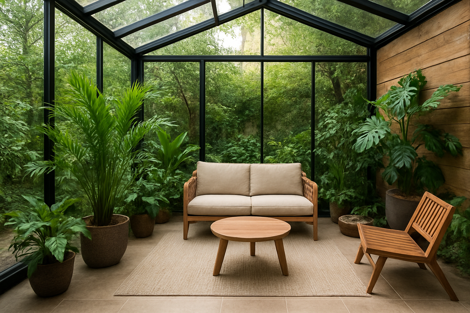
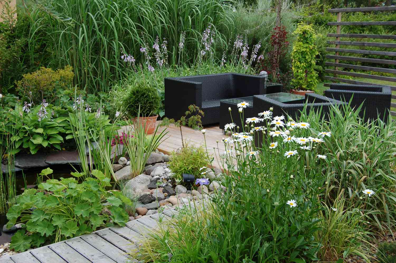
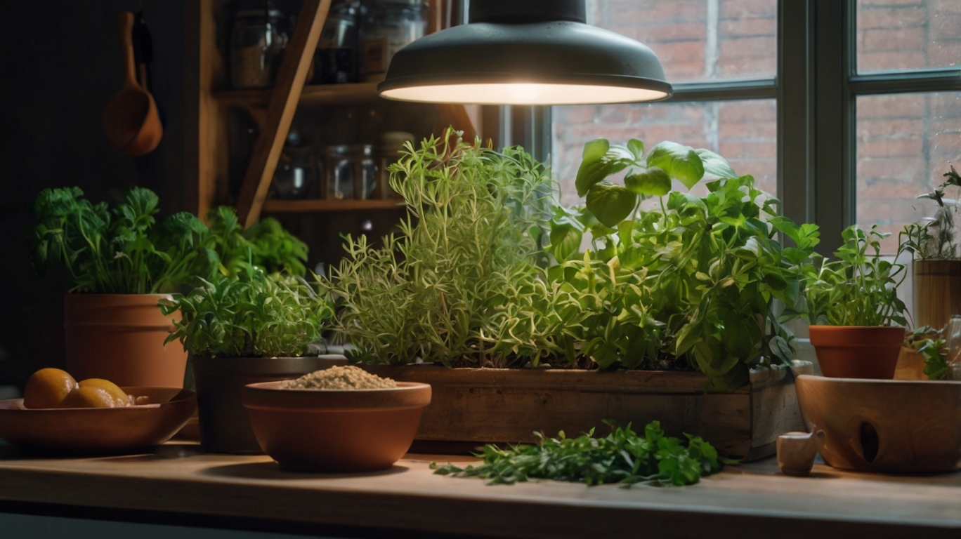
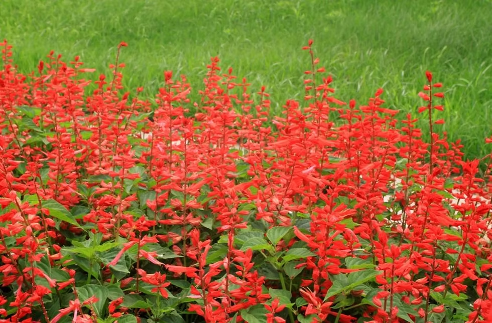
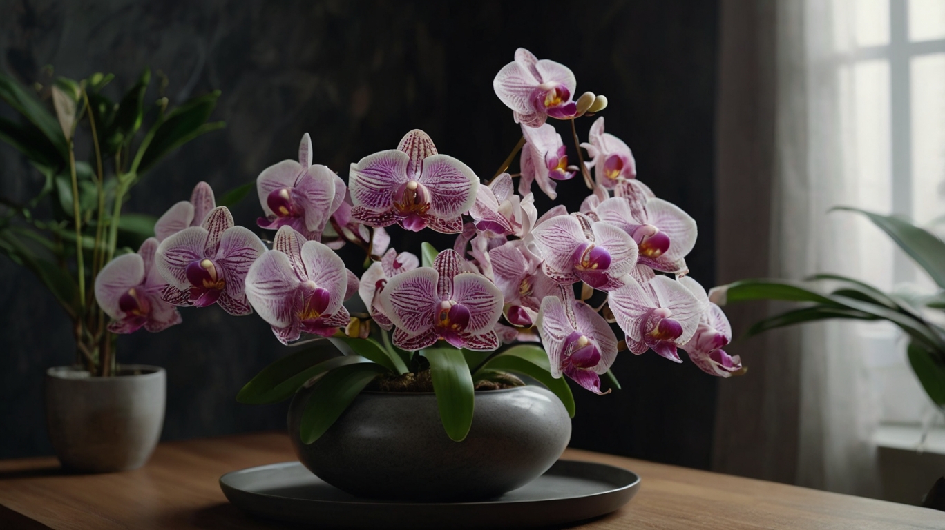
Discover how to design a stunning winter garden with the best plants, styles, and decor tips. Create an indoor sanctuary that brings nature into your home all year round. What is a Winter Garden? Have you ever wished you could enjoy the beauty of nature without stepping outside? That’s exactly what a winter garden offers. Definition and Origin A winter garden is an indoor or semi-enclosed space filled with plants, often integrated into living rooms, hallways, or even under staircases. The concept began in Europe, where glass conservatories allowed families to enjoy greenery despite harsh winters. Winter Garden vs. Traditional Garden 👉 The main advantage of a winter garden is that it extends nature into your living space, making your home feel fresher, warmer, and more inviting. Why You’ll Love Having a Winter Garden at Home 🌱 Improves Comfort and Well-Being Plants release oxygen, reduce stress, and create a peaceful atmosphere. Imagine reading your favorite book surrounded by greenery—even on a rainy day. 💡 If you love cozy spaces, check out our article on outdoor reading nooks for more inspiration. 🏡 Increases Home Value A well-designed winter garden is more than décor—it’s an architectural feature that adds charm and boosts the value of your property. 🍃 Enjoy Nature All Year Long Unlike outdoor gardens, winter gardens keep you connected to plants in every season. They’re perfect for relaxation, meditation, or spending time with family. Types of Winter Gardens Type Best Location Perfect For Indoor Winter Garden Living room, hallway, under staircase Cozy, decorative use Outdoor Winter Garden Covered verandas, rooftops, glass patios Semi-outdoor gatherings Vertical Winter Garden Apartments, small balconies, walls Space-saving design How to Plan Your Winter Garden 1. Choose the Right Location Look for areas with natural light, like near windows or under skylights. Proper ventilation is key to keeping plants healthy. 2. Pick Your Style 3. Set a Budget Best Plants for Winter Gardens Choosing the right plants makes all the difference. 🌿 Ornamental Plants: Raffia palm, Peace lily, Zamioculca.🌿 Shade-Loving Plants: Ferns, Philodendrons, Monstera Deliciosa.🌸 Flowering Plants: Orchids, Bromeliads, African violets. 👉 Want more eco-friendly plant ideas? Read our guide on using native plants for biodiversity and sustainability. Decorative Elements That Transform Your Winter Garden Maintenance Tips for Your Winter Garden Inspirational Winter Garden Styles FAQ – Frequently Asked Questions 1. Is a winter garden expensive to build?Not always. A simple DIY setup can be very affordable, while luxury glass conservatories cost more. 2. Do I need an architect?For complex projects, yes. But small setups are great DIY projects. 3. Can apartments have winter gardens?Absolutely. Vertical gardens and compact plant setups are ideal for small spaces. 4. What are the easiest plants to maintain?Zamioculca, Peace Lily, and succulents are low-maintenance favorites. 5. Does it need direct sunlight?No. Many shade-loving plants thrive indoors with indirect light. 6. Will it increase energy bills?Not if you use natural light wisely. Skylights and glass walls reduce the need for artificial lighting. Conclusion: Create Your Own Green Refuge Indoors A winter garden is more than a design choice—it’s a lifestyle. It boosts health, increases property value, and brings nature closer to your daily life. Whether you dream of a modern glass retreat, a rustic wooden corner, or a minimalist green wall, the key is to make it your own. Start small, add plants you love, and slowly build your indoor sanctuary. 🌱 Remember, every winter garden begins with just one plant. Why not start today?