Hi there, how are you? You know that feeling when you walk into a room and it feels like a warm hug? That’s exactly the vibe I’m always chasing for my home—and color is my best ally in this mission! In 2025, interior design trends are all about lightness, a connection with nature, and a touch of boldness. In this 2,000-word article, I’ll share everything you need to know about the color trends for interior decor in 2025—with a twist of gardening and cozy home vibes. Get ready for practical tips, stories from my adventures with paint and plants (yes, with some funny mishaps too), and a generous dose of joyful inspiration. Grab an iced drink and let’s turn your home into a colorful, lively sanctuary!
Why Colors Matter in Interior Design
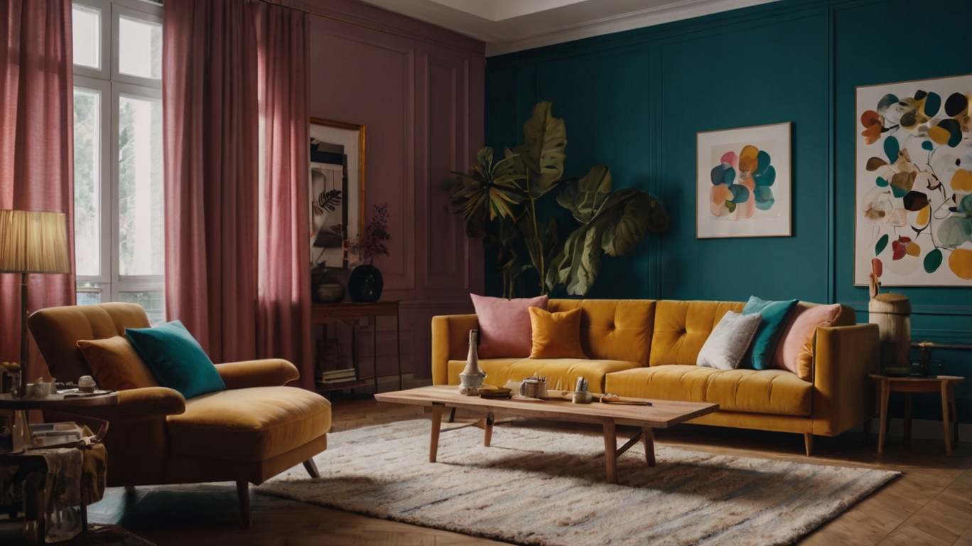
Before diving into trends, let me tell you why color is so powerful. It’s not just “pretty”—colors set the mood of a space, influence our emotions, and make a home feel welcoming. Pairing colors with elements like plants and natural textures is the secret to creating a true sanctuary. My living room, once a dull sea of beige, is now a terracotta and green oasis that makes me smile every time I walk in. And guess what? You don’t need to be a professional designer to get it right—just a bit of curiosity and courage. So, shall we explore the top colors of 2025?
1. Trend #1: Organic Greens – Bringing Nature Indoors
If there’s one timeless color, it’s green. In 2025, earthy tones like sage, moss, and olive take center stage. These hues bring calm, enhance the nature connection, and pair beautifully with houseplants.
Where to Use: Paint an accent wall in the living room or use in pillows, rugs, and curtains. I painted one of my walls sage green, and with a trailing pothos, it looks like I live in a chic jungle!
How to Combine: Mix with natural wood, beige, or gold accents for a sophisticated look.
Gardening Tip: Place a ZZ plant or fern near your green wall. The contrast of foliage and color is breathtaking!
My Story: My first green attempt was a total fail—I picked a neon shade that looked more like a store sign. Lesson learned: softer tones are easier to coordinate, and now sage green reigns supreme in my living room!
2. Trend #2: Warm Terracotta – A Hug in Color Form
Terracotta, that warm clay tone, is making a strong comeback in 2025. It’s cozy, rustic, and perfect if you want your home to feel like a nest.
Where to Use: Great for bedrooms or kitchens—use on walls, vases, or throws. I have terracotta pillows on my sofa, and they bring a “sunset glow” to the room.
How to Combine: Looks amazing with greens, creams, or navy for a modern contrast.
Gardening Tip: Pair with clay pots and succulents. My aloe vera in a terracotta pot is the star of my balcony!
Funny Moment: I once painted a wall terracotta without using primer, and it ended up looking like abstract art. Now I follow instructions carefully, and my bedroom feels like a warm hug!
3. Trend #3: Deep Blues – Calm and Sophistication
Deep blues like navy and petrol blue are trending in 2025. They exude serenity and elegance—perfect for anyone seeking a peaceful home.
Where to Use: Living rooms or bedrooms. A navy wall creates a stunning backdrop for art or shelves. I painted a bedroom wall petrol blue, and with warm lighting, it feels like a boutique hotel.
How to Combine: Mix with whites, grays, or mustard accents for a fresh, modern feel.
Gardening Tip: Place a snake plant in a white pot near the blue wall. The contrast is incredibly chic!
My Experience: My first blue was too pale and made the room feel dull. I learned that deep tones have more impact—now my bedroom is my favorite hideaway!
4. Trend #4: Soft Yellows – A Ray of Sunshine
Soft yellows like pale mustard and vanilla are on the rise for bringing joy without overwhelming the space. Ideal for brightening dull corners.
Where to Use: Kitchens, balconies, or small accents like cushions and curtains. I have a vanilla-yellow rug on the balcony, and with plants, it feels like a sunny garden.
How to Combine: Gorgeous with greens, terracotta, or grays. Just don’t overdo it to avoid eye fatigue.
Gardening Tip: Pair with basil or mint in yellow pots. My kitchen herb garden came alive with this hue!
Classic Mistake: I once bought a bright yellow pillow that screamed on my sofa. I swapped it for a vanilla tone—now everything flows beautifully!
5. Trend #5: Warm Neutrals – The Perfect Foundation
Neutral tones like beige, sand, and taupe never go out of style, but in 2025 they’re warmer, almost creamy. These are the perfect base for vibrant accents.
Where to Use: Walls or large furniture like sofas. My living room walls are warm beige and they make all my colorful pillows and plants pop.
How to Combine: Mix with greens, blues, or terracotta. Add wood or rattan for a complete look.
Gardening Tip: Place an areca palm in a corner with neutral walls—it instantly becomes a natural focal point.
My Journey: My living room used to be all white and felt like a hospital. With warm beige and a ZZ plant, it’s now the definition of cozy!
6. How to Apply These Colors at Home
Now that you know the trends, let’s put them into action! Here are some tips for using these colors with confidence:
Walls:
Paint one feature wall (like in the living room or bedroom) with sage green or navy. Keep the rest neutral.
Use washable paints in kitchens and bathrooms. My terracotta kitchen wall survives all the cooking splashes!
Furniture & Textiles:
Sofas or armchairs in neutral tones are versatile. Add terracotta or yellow pillows for a trendy 2025 look.
Sheer green or blue curtains create a calming atmosphere. My living room curtains sway with the breeze—it’s mesmerizing!
Decor Accents:
Vases, rugs, and wall art are perfect for experimenting with color. I mix terracotta pots and succulents on the balcony for a rustic-chic look.
Warm lighting (soft LED bulbs) enhances colors. My balcony glows like magic at night with solar lights!
7. Blending Colors and Gardening
The 2025 color trends call for a natural touch, so here’s how to combine them with greenery:
Living Room: Sage green wall + trailing pothos = instant charm. Mine has grown so lush it looks like a living curtain!
Bedroom: Navy wall + peace lily on the nightstand = serene oasis. The soft scent of the lily helps me unwind.
Kitchen: Vanilla yellow + windowsill basil = cheerful and practical. My whole kitchen smells fresh!
Balcony: Terracotta wall + ferns + LED string lights = relaxation haven. My balcony is my private outdoor café.
Quick DIY: Paint aluminum cans in 2025 colors (like terracotta or green) and plant herbs. I did this in my kitchen—those cans are now the highlight of the space!
8. Avoiding Common Decorating Mistakes
Test First: Buy paint samples and try them in small areas. I saved my living room from a horrible lime green thanks to a test!
Balance: Use bold colors like navy on just one wall, keeping the others neutral. My living room feels harmonious thanks to this rule.
Lighting Matters: Dark colors need warm lights to avoid looking heavy. My terracotta balcony glows with soft LED lighting.
Funny Mistake: I once painted a wall mustard yellow without testing—it looked like a giant sunflower field! Now I always sample and balance with neutrals.
9. My Personal Journey with Color and Plants
When I moved into my apartment, it was a sea of bland white walls. I started with a single succulent and a green pillow, but soon I fell in love with color. Today, my home blends sage green, terracotta, and warm neutrals—with plants in every corner, from pothos in the living room to mint in the kitchen. Every color and plant tells a story, and my home has never felt more alive and welcoming. Gardening and cozy decor taught me that a splash of color can truly transform everything.